
Nelnet: Helping students to dream, learn and grow
Nelnet, the National Education Loan Network, had grown fast, bringing six companies together under one name. But the brand hadn't caught up with the business. Six identities were still visibly competing for the same customer, and the result was a company that couldn't clearly say who it was.
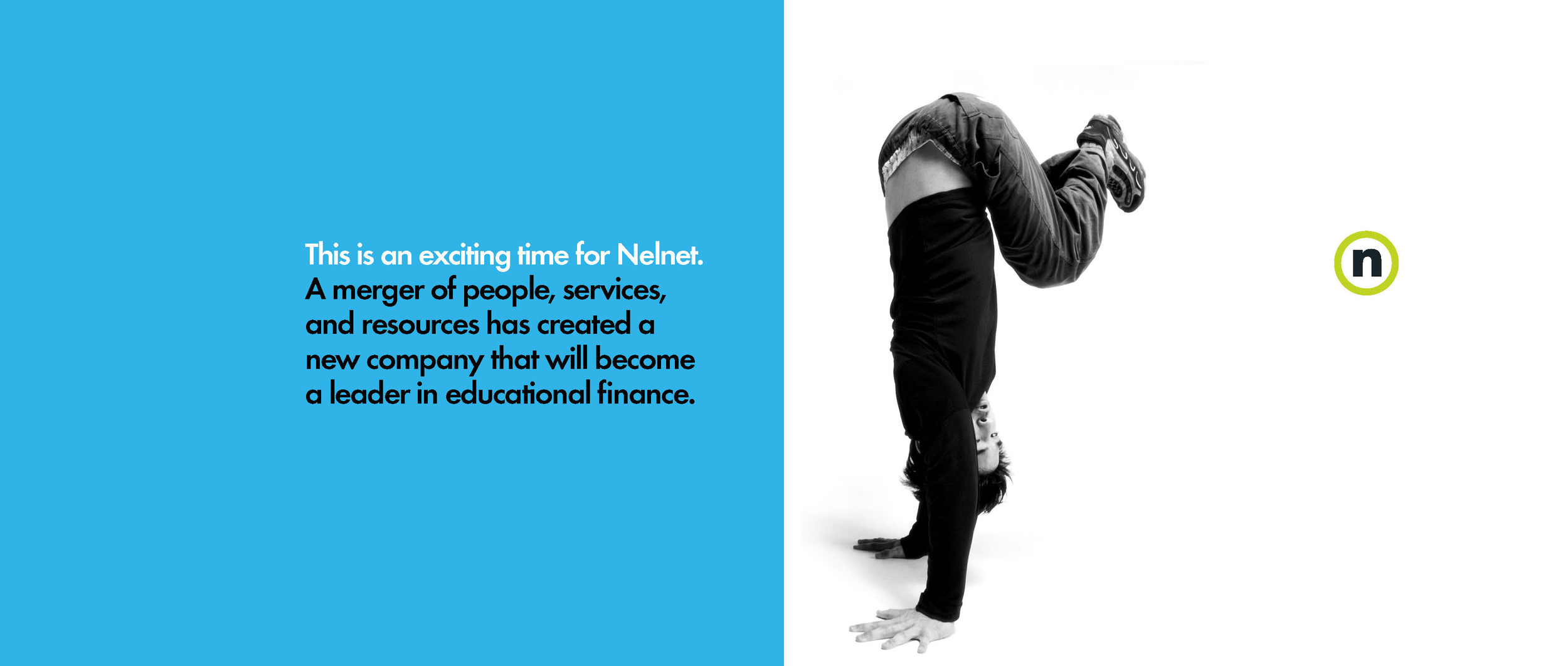
I led the team that started the work from the inside. Through interviews with key players across the six organizations and their clients, we surfaced a truth the business had outgrown its ability to articulate: Nelnet helps people go to college.From there came three brand values — dream. learn. grow. — that spoke to students and the newly merged company at the same time. One idea, two audiences: a finance company that could sound like a student's future instead of a lender's balance sheet.
My team and I built the identity around a single letter. The "circle-n" worked as both logotype and seal, and opened up a naming architecture of quiet elegance. Sub-brands became Nconcert, Ntrust, Npower. Every product name read as "n" and "in" at the same time, pulling the portfolio into the parent with a single visual move and accelerating the trademark process along the way. From there, we rolled out the full brand infrastructure, standards manual, illustration library, websites, templates, and collateral, so every employee could carry the brand forward. Nelnet stopped being six companies sharing a name and became one company with a story worth telling.
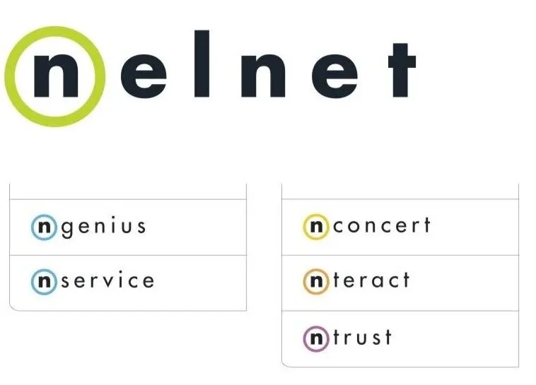
Logo design and product name development

Brand values and business voice
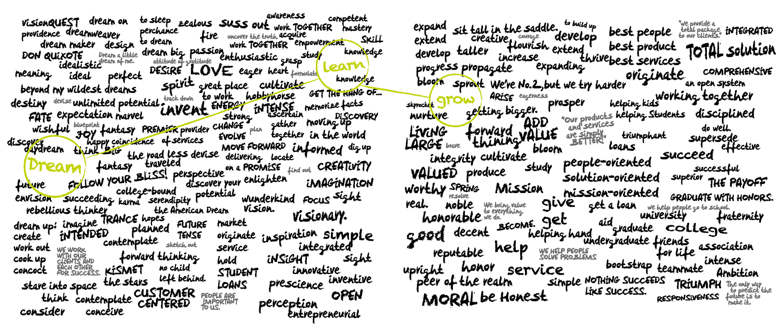
Brainstorming board

Photography and illustration style

Visual identity toolkit

Website design