BRANDING for PROFESSIONAL SERVICEs firms
I have worked on brand identity programs for professional services firms such as Deloitte, Andersen, Accenture, Baker McKenzie, Venable and Honigman. These experiences have given me a deep understanding of the unique challenges and opportunities in professional service environments. I design brands that differentiate by discovering connection points between company and client with a human-centered, strategy-driven, and design-savvy approach.
Bracewell
REBRANDING: Bracewell is one of the nation’s largest law firms. Founded in Houston, the firm has offices in New York, Washington, D.C., Houston, Dallas, Austin, London, and Kazakstan. The firm needed a new name, brand strategy, and visual identity to bring greater emphasis to its capabilities and also its new name partner. The brand launch included a revised logo, brand strategy, visual identity, website redesign, marketing materials photography, and a unique grab-and-go business development folder kit.
Baker McKenzie
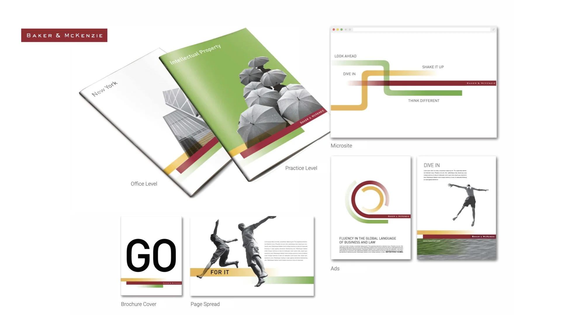
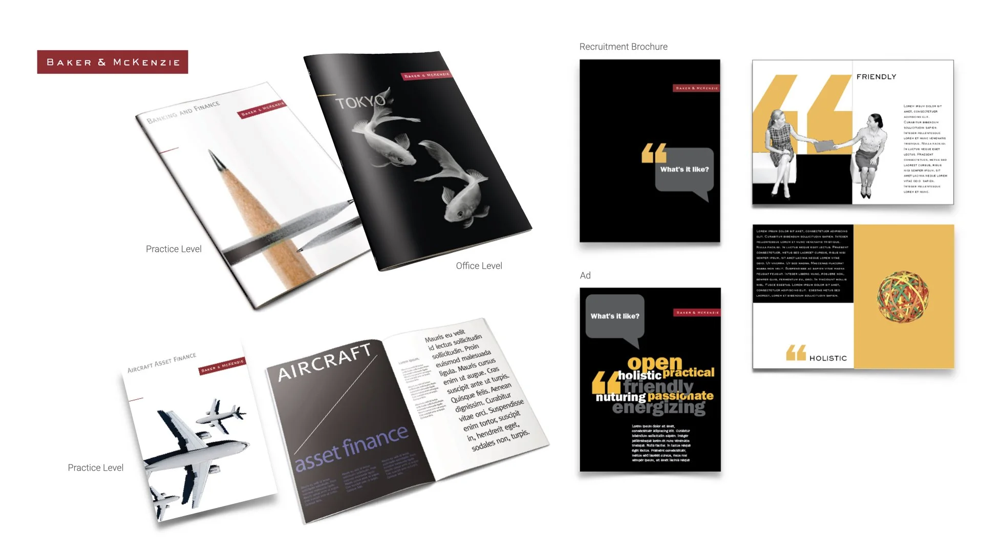
REBRANDING: Baker & McKenzie embarked on redesigning their logo; however, the outcome of this year-long process was to retain the current logo but update the brand architecture and marketing materials. The biggest challenge was transitioning into the new brand and supporting 70 international offices. As creative director, my team recommended first devising a brand architecture to demonstrate how the firm would go to market. With it marketers would be able to quickly identify their particular communication needs, to consistently apply the new identity no matter where in the world the materials were produced. My team and I created a brand identity design system plus a website to manage it across the 70 international offices. The site included guidelines, templates, artwork, and a best practices marketing communications collateral gallery demonstrating real-world practical applications.
2008 brand identity refresh
Andersen
BRAND LAUNCH: Arthur Andersen was the leading provider of professional services in 90 countries. The firm decided to rename itself as just Andersen and rebrand itself to reflect the new economy of the 21st century. Enterprise IG in London created the initial brand architecture. Because my team and I were extremely experienced with Andersen's culture and business groups, we were asked to make this new theoretical brand architecture into a more practical application and deliver it for a forthcoming global brand launch.
As creative director, my responsibility (and my team's) was to be the go-to guys for the fledgling brand identity. Ultimately, my team and I made the new Andersen brand a reality. We managed and applied the new visual identity and delivered over 122 items of marketing literature, webpages, and over 120,000 photographs under a tight deadline for the global brand launch. In addition, we developed a training immersion boot camp for Andersen employees on how to use and apply the new visual identity.
“Without exception, Dave exceeded our expectations to provide beautifully considered design solutions.”
Deloitte
SUB-BRANDING: When Deloitte & Touche rebranded into simply Deloitte with a green dot, it simplified and unified its branding worldwide. Deloitte’s US Tax Practice group wanted to be the first to apply the new branding and create a differentiating sub-brand. My team and I recognized that service lines with the Deloitte Tax Practice could not share one branding message without redundancy. So my team and I created a series of alternative branding messages to broaden the appeal of the master theme, “Stay on Top.” This created variety in messaging with a greater selection for marketers. The visual design of the themes could be literal or metaphoric and ranged from sports analogies to business situations and demonstrated the themes differentiated yet worked together as marketing materials.
Venable
REBRANDING: The law firm Venable wanted a fresh look but not a new logo. Instead, they wanted a “more modern look and feel to stand out from the typically conservative law industry. So, as creative director, my team and I created a new brand identity redesign that was more modern yet professional and approachable. It included a simplified and easy-to-use proposal system, marketing collateral, and a brand toolkit with color, typography, layout, and photography style specifications.
LRN
BRANDING: LRN is an American company which advises companies on ethics and regulatory compliance. Initially the company focused on the legal industry and was named Legal Research Network, before expanding into other fields. Based on my work with Andersen and Deloitte, I was hired as an independent contractor to design and deliver a more compelling visual brand identity system around the existing logo and extend it into marketing collateral, invites, POVs, white papers, website and custom photography. The visual identity is still in use today.
“Dave consistently delivers elegant, thoughtful design solutions that bring a brand’s story to life across all touchpoints.”
Grant Thornton
CAMPAIGN: While working for a digital agency as the creative director, I created campaign directions with a strategy writer to pitch to our client, Grant Thornton. The subsequent campaign, "Get up And StatusGo" is focused on how Grant Thornton goes beyond the expected to drive your business forward. “While others follow a formula, we listen and customize to drive business forward. We replace hoops and hurdles with a streamlined approach. It’s what clients deserve—not what they’re used to. Forget about the status quo, get up and Status Go.”
“Dave is strong in mentoring and getting the best out of his staff. He is supportive and collaborative in a way that is rare in people at his level. ”
Honigman
BRAND DESIGN: I am currently a contract creative director for Honigman, a law firm based in Michigan with offices in Chicago, DC and Israel. Because of my NDA I cannot show any in-depth branding work. However I can share a few fun PowerPoint charts.
“Dave approaches every project with both a creative curiosity and a collaborative warmth, regardless of its size.”
Don’t forget to see the rest of my branding work.


